Category:
Brand Identity
Duration:
Two Weeks
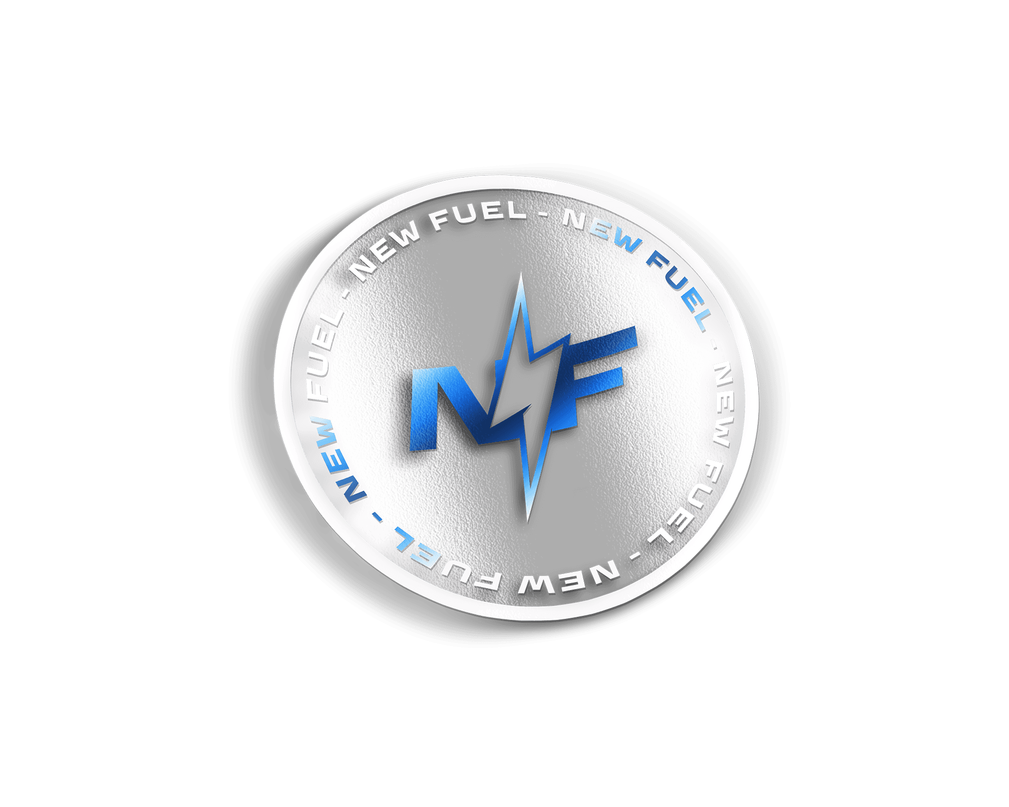
NewFuel is a groundbreaking non caffeinated energy drink that challenges the norms of traditional energy beverages. Designed for a youthful, health conscious audience, the brand is built on a foundation of natural energy boosters like Maca Root, Carob, and Ginseng, offering clean, sustainable energy without the crashes and anxiety caused by caffeine.
This project aimed to bring NewFuel’s vision to life with a vibrant, gender neutral brand identity that resonates with 18 to 29 year olds. Inspired by pop art and postmodern aesthetics, the visuals embrace bright, contrasting colors and playful, youthful designs to stand out on shelves and social media alike.
MY APPROACH
To create a fresh and vibrant identity for NewFuel, the approach began with in depth research into the energy drink market, identifying gaps and opportunities to target a youthful, health conscious audience. The brand identity was built around bold, pop art inspired aesthetics, avoiding predictable organic visuals in favor of bright, gender neutral colors that stand out. Packaging design was crafted to make Berry Booster, Creamy Booster, and Lightning Booster visually distinct while maintaining a cohesive brand family. Messaging was playful and approachable highlighting the natural energy boosters and caffeine free formula. Finally, the strategy incorporated a dynamic social media presence, designed to resonate with the 18 to 29 demographic while elevating NewFuel as a fun, healthy alternative in the energy drink space.
VISION AND INNOVATION
The NewFuel energy drink branding project envisions delivering a dynamic, vibrant, and refreshing identity that reflects the bold flavors and energizing essence of the brand. By utilizing vibrant color schemes, striking visuals, and high energy compositions, the project aims to create a brand experience that excites the senses and resonates with health conscious and active individuals seeking a daily boost. This vision captures the essence of emphasizing vitality, freshness, and impact through captivating design.

CHALLENGES
One of the main challenges was achieving the perfect balance between dynamic energy and visual clarity in the mockups. Ensuring that the composition of fruit, splashes, and cans looked both natural and eye catching required meticulous adjustments.
PROBLEMS
Aligning the vibrant color palette with product branding while keeping the design visually cohesive was also a demanding process. Additionally, fine tuning the lighting, shadows, and splash effects to enhance realism while maintaining a bold, polished look took significant effort and experimentation. Overcoming these hurdles involved iterative refinements and creative problem solving to bring the vision to life.

USER CENTRIC DESIGN
The project prioritized user centric design by creating visuals that resonate with the energy driven lifestyle of their target audience. The bright, vibrant colors and dynamic compositions were intentionally designed to grab attention and evoke excitement, mirroring the product’s promise of vitality and refreshment. By incorporating fresh fruits and splashing effects, the mockups highlight the natural, flavor forward aspects of the drink, aligning with health conscious consumer preferences. The design also ensures adaptability across various platforms, from digital ads to packaging, to meet the audience wherever they interact with the brand.
USER NEEDS
This project addressed user needs by focusing on creating a visual identity that emphasizes energy, flavor, and freshness, all key factors for consumers seeking an energy drink. The bold typography and vibrant imagery directly appeal to the target demographic of active, health conscious individuals who want a product that fuels their day while standing out on shelves and online. The designs also meet the need for clarity and recognition, ensuring the product can be quickly identified and associated with vitality and performance in a competitive market.